top of page


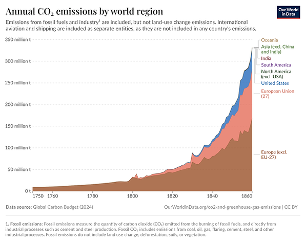
Our World in Data, Annual CO₂ Emissions by World Region, 1750-1860
This stacked area graph from Our World in Data shows the annual CO2 emissions from fossil fuels and industry, measured in tonnes, by world region from 1750 to 1860. The graph on the website is interactive, allowing users to hover over a particular region and view its estimated emissions at a specific time. Users can also extend the time beyond 1860, or play an animated time lapse. The graph shows a substantial increase in the amount of CO2 that the United States, along with European countries, began emitting around 1830. It illustrates one consequence of increasing urbanization and industrialization in the United States and Europe during this time period.
bottom of page