

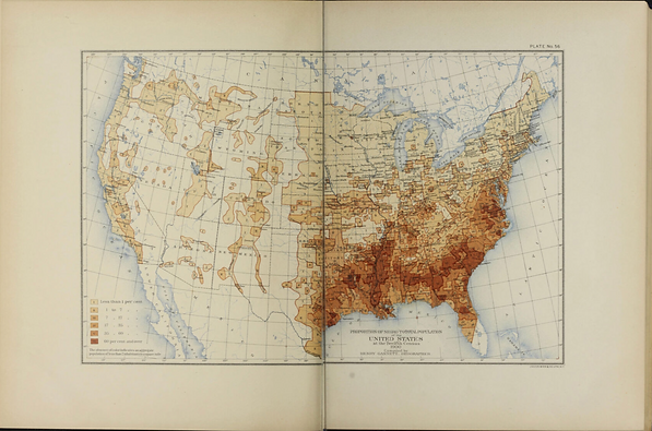
U.S. Census Office, Proportion of Black to Total Population of the United States (1903)
This choropleth map, included in the 1900 Statistical Atlas of the United States compiled under the direction of Henry Gannett, uses data from the 1900 U.S. Census to depict the proportion of the Black population relative to the total population in each county of the United States. Gannett explained that the purpose of the map was to “clearly outline the areas in each state upon which the [Black population] are most thickly settled” (p. 43). Darker shading indicates a higher proportion of the Black population within a county. The darkest concentrations appear primarily in Alabama, Georgia, and South Carolina, as well as along the Mississippi River in Louisiana and Mississippi. Overall, the map shows that the highest proportions of the Black population were concentrated in the South and parts of the East Coast. This settlement pattern largely reflects the historical legacy of slavery in these former slaveholding states.